Bathroom Tile Colour Guide: How to Choose and What Works with Your Space
Practical advice on choosing bathroom tile colours. How light, room size, and tone affect the result, and why the colour you see in the showroom is not the colour you get at home.
Choose bathroom tile colour by the light the room actually gets, not by how a sample looks in the showroom. Warm neutrals (sand, oat, greige, sage) are the safest current choice for most bathrooms, and in a small room one consistent colour used everywhere beats any clever combination.
Tile colour is the decision that bathroom renovators agonise over most, and it’s the one where the showroom experience is most misleading. A tile that looks perfect under showroom lighting, held at arm’s length against a white display board, will look completely different on your bathroom wall under a different light source at a different angle surrounded by different colours.
This guide is what I tell clients during site visits when they’re weighing up colour options. It’s based on what I see working in real bathrooms across Bromley and South East London, not what looks good in a catalogue. The photos are my own installations, so you can see how each colour family behaves on a real wall rather than a display board.
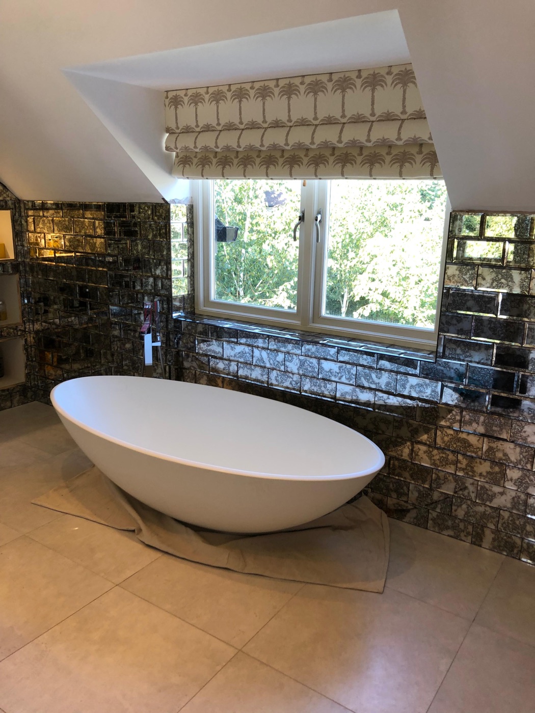 Luxury bathroom, Bromley. Warm metallic tones against dark surfaces create depth and atmosphere that cool white cannot achieve. Colour choice is inseparable from light source and room size. Bathroom tiling service in Bromley
Key takeaways:
- Light direction matters more than personal preference: north-facing rooms need warm tones, south-facing rooms flatter almost anything.
- The 2026 direction is warm: sand, clay, sage and greige are in; cool blue-grey is fading.
- In small bathrooms, consistency beats lightness. One colour everywhere makes the room feel bigger.
- Always take samples home and view them in the actual room, wet and dry, at different times of day.
The light question comes first
Before choosing a colour, understand the light in your bathroom. This matters more than personal preference because light changes how every colour reads.
North-facing bathrooms receive cool, blue-tinted natural light. Cool-toned tiles (blue-grey, white, silver) in a north-facing room can feel clinical and cold. Warm-toned tiles (cream, sand, terracotta, sage) compensate for the cool light and create a more inviting space.
South-facing bathrooms receive warm, golden natural light. Almost any colour works here because the natural warmth flatters everything. Cool tones read as fresh rather than cold. Warm tones glow.
East-facing bathrooms get morning light (warm) and are shadowed in the evening. Consider how the bathroom is primarily used: a morning shower benefits from warm light on warm tiles, which is naturally what happens here.
West-facing bathrooms are shadowed in the morning and lit warmly in the afternoon/evening. The opposite of east-facing.
No windows (interior bathrooms). Entirely dependent on artificial lighting. Warm LED downlights (2700K-3000K) paired with warm-toned tiles create the most flattering environment. Cool white LEDs (4000K+) with cool tiles create a clinical feel that reads as institutional.
Most people choose tiles under showroom conditions (bright, neutral, overhead lighting) and install them in a room with completely different light. I always recommend holding a sample tile in the actual room at different times of day before committing.
The 2026 direction: warmth
The dominant colour direction in UK bathroom tiling has shifted decisively from cool grey to warm neutrals. This started around 2023 and by 2026 is firmly established.
What is trending: Sand, oat, putty, biscuit, clay, terracotta, warm taupe, sage green, olive, muted green. Surfaces that feel natural, earthy, and organic.
What is fading: Cool grey, blue-grey, stark white, high-contrast monochrome. These are not disappearing (they still have appropriate uses) but they no longer feel current as the default direction.
What endures: White and off-white remain timeless. A warm white (not brilliant white) is safe for any decade. True black remains a bold, effective choice in the right context.
The practical implication: if you’re tiling a bathroom you want to feel current for the next decade, warm neutrals are the safest bet. Cool grey will feel dated within five years. White will never feel dated.
Colour by room size
Small bathrooms (under 4 square metres)
The conventional advice is “use light tiles”. This is partly right: light tiles reflect more available light, which helps in a small space with limited natural light.
But consistency matters more than lightness. A small bathroom in a single mid-tone colour (one tile on floor and all walls) feels larger than a small bathroom with light walls and a dark floor, because the dark floor creates a visual boundary that emphasises how small the floor area is.
The tile drenching approach (one colour, everywhere) is the most effective strategy for small bathrooms regardless of the actual colour chosen. See small bathroom tile ideas and tile drenching trend.
Medium bathrooms (4-7 square metres)
More flexibility. You can introduce contrast (different floor and wall colours), accent walls, and feature elements without fragmenting the space. Two colours maximum is the practical guideline. Three or more colours in a medium bathroom starts to feel busy.
Large bathrooms (7+ square metres)
Large bathrooms can handle darker tones, strong patterns, and more visual complexity. A large bathroom in warm terracotta or deep sage reads as luxurious. The same colours in a small bathroom would need the tile drenching approach to avoid feeling cramped.
Specific colour guidance
White and off-white
 Warm white in practice: calacatta-effect hexagons in Bromley with gold veining over an ivory base, not brilliant white. The warmth is in the veining, and it changes how the whole room feels. Marble and natural stone tiling in Bromley
Where it works: Everywhere, always. White is the safest possible tile choice. It maximises light, reads as clean, and never dates.
The nuance: Choose warm white (cream, bone, ivory) rather than brilliant white. Brilliant white under artificial light reads as sterile. Warm white reads as fresh and inviting. The difference on the shelf is subtle. The difference on the wall is significant.
Maintenance: White tile is easy to maintain. White grout in wet areas is not. Use matching off-white or light grey grout rather than brilliant white, and specify epoxy grout in the shower. See grout colour guide.
Grey
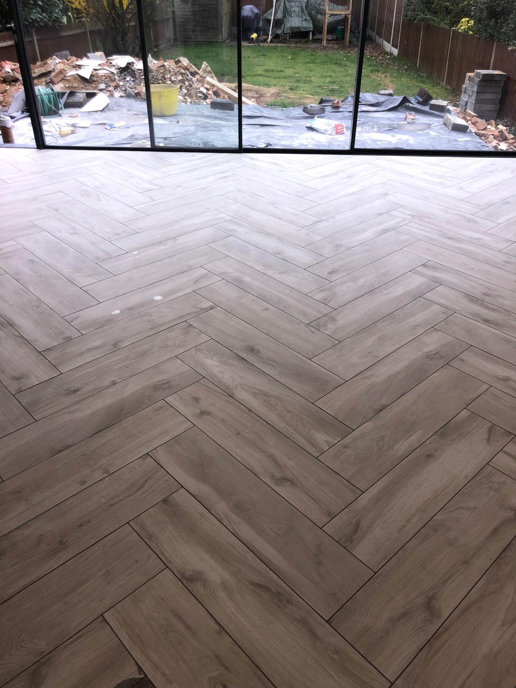 Grey that still feels current: a warm grey herringbone floor in Orpington. The pattern provides the texture that stops grey from reading flat, which is the usual failure mode. Kitchen floor tiling in Orpington
Where it works: Contemporary bathrooms, wet rooms, kitchens. Grey is neutral, practical, and hides marks well.
The risk: Cool grey (blue undertone) now reads as the 2015-2020 default. If you want grey in 2026, choose warm grey (greige) with a beige or taupe undertone. This reads as current.
Best application: Large format matte porcelain in warm grey, tile drenched across floor and walls. Stone-effect or concrete-effect finishes add texture that prevents grey from feeling flat.
Sage and green
Where it works: Feature walls, metro tiles, full bathrooms in the right context. Green is the strongest colour trend in UK bathrooms in 2026.
The nuance: Sage, olive, and muted green work best. Bright green (mint, emerald) dates faster. The muted tones feel natural and calming. They work exceptionally well as handmade-effect metro tiles or zellige.
What to pair it with: Brass or brushed gold fixtures. Warm wood tones. White sanitary ware. Avoid chrome with sage, it clashes with the warmth.
Terracotta, clay, and rust
Where it works: Mediterranean-inspired bathrooms, kitchens, period properties, statement spaces.
The nuance: These are strong colours that make a statement. They work best in rooms with good natural light where the warmth is flattering. In a dark interior bathroom, terracotta can feel heavy.
Best application: As a feature. A terracotta floor with plain walls, or terracotta zellige on one wall with neutral tiles elsewhere.
Black and charcoal
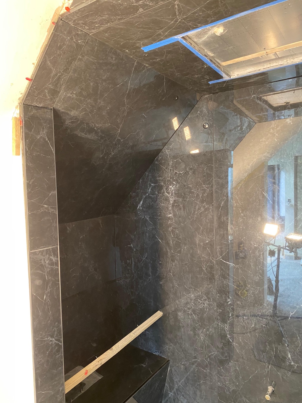 Dramatic dark done with consistency: black marble across every surface of a West Wickham wet room, with grout matched so the lines disappear. This is the tile drenching principle applied to a dark tone. Wet room installation in West Wickham
Where it works: Bold, dramatic bathrooms and wet rooms. Excellent in large, well-lit spaces.
The reality: Dark tiles show every water mark, soap spot, and cleaning streak. Matte black is more forgiving than gloss black, but both need more frequent wiping than lighter tiles. See matte vs gloss tiles.
Best application: Tile drenching in matte black or charcoal for a dramatic, cohesive look. Dark tiles with matching dark grout (so the grout lines disappear) in a wet room is one of the most striking bathroom designs available.
Blue
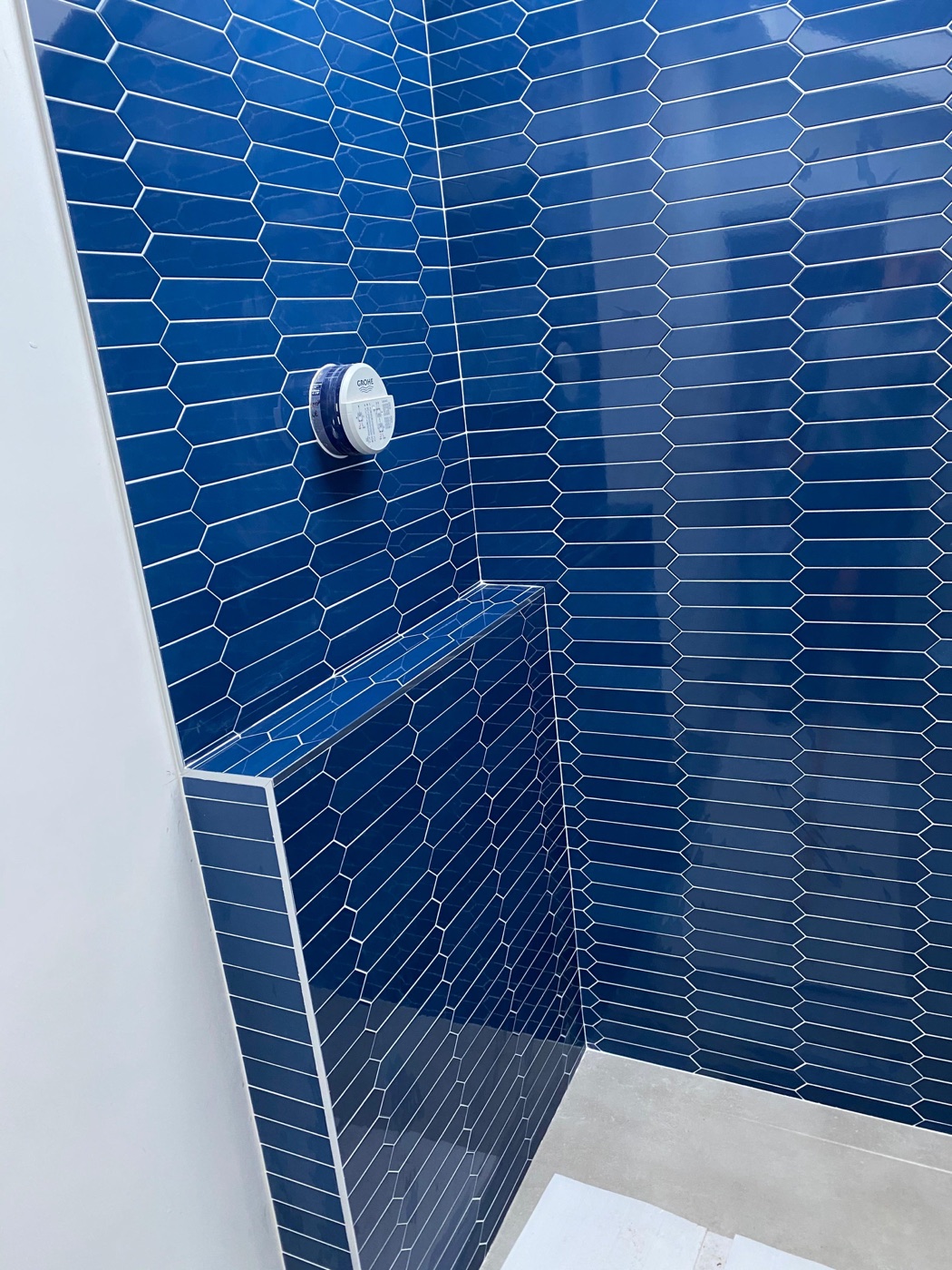 Navy that avoids the dated-blue trap: deep navy hexagons with a tiled bench in Beckenham. Muted, dark blues read as current in a way primary blue never will. Bathroom tiling in Beckenham
Where it works: Mediterranean and coastal aesthetics. Feature walls and splashbacks. Less common as a full-room colour.
The risk: Blue bathroom tiles can read as dated (1980s and 1990s bathroom suites were heavily blue). Modern blues (deep navy, muted denim, grey-blue) avoid this association. Bright or primary blue does not.
The showroom-to-bathroom gap
The single biggest source of disappointment in bathroom tile selection is the difference between how a tile looks in a showroom and how it looks installed in your bathroom.
Why they look different:
- Lighting. Showrooms use bright, neutral overhead lights. Your bathroom has different light.
- Scale. Holding one tile at arm’s length is completely different from seeing 20 square metres of it on your walls.
- Surroundings. A tile against a white display board looks different from the same tile against your ceiling colour, your bathroom fixtures, and your window frame.
- Grout. Showroom displays often show tiles without grout or with perfectly matched grout. Real grout in a real bathroom changes the colour impression significantly.
How to avoid the gap:
- Take sample tiles home and hold them against the actual bathroom walls.
- View them at different times of day under the actual room lighting.
- View them wet. Tiles look different wet, and your bathroom tiles will be wet frequently.
- Test grout colour alongside the tile, not separately.
- Look at a large enough sample. A single tile is not representative.
For help choosing the right colour for your specific bathroom, get in touch for a free site visit. I can advise based on the room, the light, and how you plan to use the space.
See also: bathroom tiles complete guide | bathroom tile trends 2026 | matte vs gloss tiles
Got a specific question? Call me on 07990 521717 , see the bathroom tiling service, or use the contact form. I'm happy to give advice with no obligation.