Metro Tile Bathrooms: A Tiler's Guide to Doing Them Right in 2026
Metro tiles are the most popular bathroom wall tile in the UK. How to use them well, the patterns that work, and the mistakes that make them look dated.
Metro tiles have been the default UK bathroom wall tile for the past fifteen years. They are everywhere — white tiles, dark grout, brick bond, behind every basin in every bathroom in every renovation magazine. Used well they still look excellent. Used badly they look like a tired cliche from 2014.
The difference is in the choices. Tile size, colour, pattern, grout, and finish all combine to make a metro tile bathroom feel either current or dated. This guide is what I tell clients who want metro tiles but want to make them feel intentional rather than predictable.
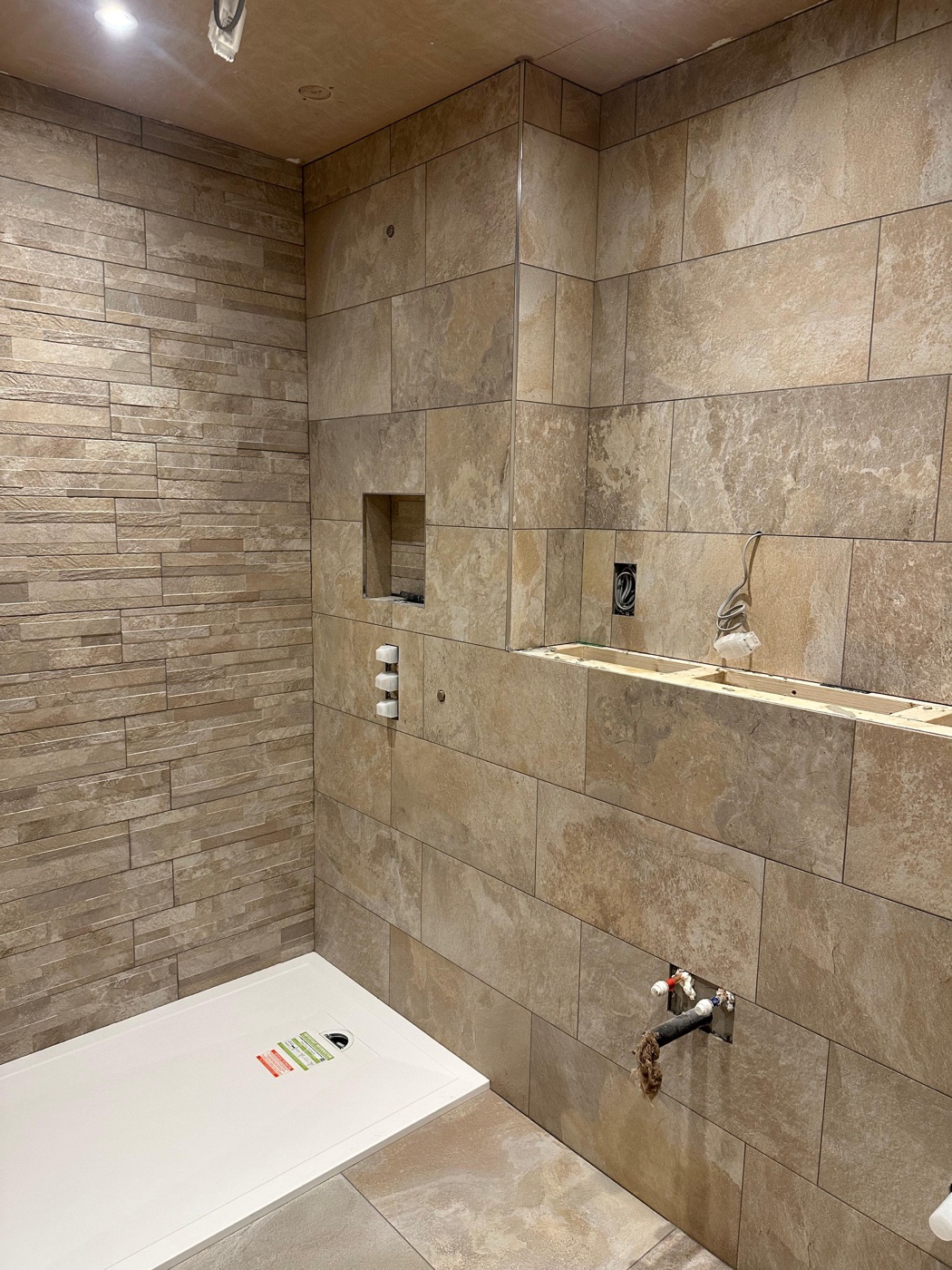 Stone porcelain shower with twin niches, West Wickham. Not a metro tile, but the same principles apply: tile size, finish, and grout colour together determine whether a wall reads as considered or default. Bathroom tiling service
A quick history of metro tiles
The original metro tile was made for the London Underground in 1903. Glossy white ceramic, beveled edges, designed to reflect the limited gas-light of the era and be easy to clean of soot. The size was 75x150mm. The shape and finish were chosen for practical reasons that happened to age into a classic look.
Modern “metro” tiles are reproductions of this design, available in countless variations. The key thing to understand is that the metro tile has nostalgic associations — subway stations, Victorian engineering, early 20th century industrial design — that influence how it reads in a contemporary bathroom.
When you use metro tiles you are quoting from this history. The question is whether you are quoting it well or just defaulting to it.
What dates a metro tile bathroom
The version of metro tile bathrooms that now reads as dated:
- Standard 75x150mm white machine-made metro, brick bond, dark grey grout, as the only design element in the room.
Every part of this is fine in isolation. Combined and overused, it has become the default that signals “we wanted to do something but did not want to think hard about it”. It was the contemporary choice in 2014. In 2026 it reads as the safe choice.
What makes metro tile bathrooms feel current in 2026
Pattern variation
The single biggest improvement to a metro tile installation is changing the pattern from standard horizontal brick bond.
Vertical brick bond. Tiles installed vertically rather than horizontally. Same metro tile, completely different visual effect. Elongates the wall. Particularly effective in bathrooms with low ceilings.
Herringbone. Metro tiles in herringbone pattern is striking and contemporary. Works particularly well on shower walls or behind a basin. The labour cost is significantly higher because of the angled cuts, but the visual impact is dramatic. See herringbone bathroom tiles.
Vertical stack bond. Tiles aligned in vertical columns rather than offset. Very contemporary, very minimal. Reads as more modern than traditional brick bond.
Double brick bond. Two rows of tiles staggered together. Slower visual rhythm than standard brick bond. Less common, more interesting.
90-degree variation. Some metro layouts alternate horizontal and vertical tiles in deliberate patterns. Custom and labour-intensive but can be exceptional in the right context.
Colour
White metro tiles are not the only option and have not been for years.
Sage and olive green metro tiles are one of the strongest 2026 directions. They read as natural, sophisticated, and contemporary while keeping the metro form factor familiar.
Warm terracotta and rust metro tiles tap into the broader warm tone trend in interiors. Feel earthy and characterful.
Charcoal and matte black metro tiles in a small bathroom create a dramatic, intimate feel. Best with matching dark grout for a tile drenching effect.
Cream and bone white metro tiles instead of cold white feel softer and more sophisticated. The slight warmth is significantly more flattering in daily use.
Glazed pastel metro tiles in soft pinks, blues, and yellows are having a moment. Used as a single feature wall they create a confident colour statement.
Finish
The finish of the tile matters as much as the colour.
Matte glaze reads as more contemporary and premium than gloss. Hides water marks better. Suitable for shower areas where slip resistance matters on walls less.
Handmade or kiln-glazed tiles have variation across the tile face that reads as character. The best metro tiles in 2026 mimic the handmade quality of zellige in a more affordable, more practical format. See zellige tiles guide.
Subtle texture or fluting within the metro tile shape adds another dimension. Fluted metro tiles are a 2026 development and worth considering. See fluted and textured tiles.
Grout
Grout colour is half the visual impact of any metro tile installation.
Matching white grout with white tiles creates a clean, contemporary look. The tiles read as a continuous surface rather than a brick pattern. Modern and minimal.
Mid grey grout with white tiles is the classic high-contrast metro look. Defines every tile clearly. Reads as graphic and traditional. Now overused enough that it can feel dated.
Tonal matching with coloured tiles — sage grout with sage tiles, terracotta grout with terracotta tiles — gives the most cohesive premium look.
Dark grout with light tiles is dramatic but unforgiving. Every slight inconsistency in tile alignment is highlighted. Requires precise installation. See grout colour guide.
Where metro tiles work best
Shower walls. The original use case. Practical, water-resistant, easy to clean.
Behind a vanity. Perfect proportion for a backsplash above a basin.
Half-height feature wall. Metro tiles to dado height with painted wall above creates a transitional bathroom feel that suits period properties.
Full-height in compact bathrooms. A small bathroom fully tiled in metro tiles can read as intentional and characterful, particularly in coloured varieties.
Where metro tiles do not work as well
Floors. Metro tiles are wall tiles. They are not rated for floor use, the format is wrong for floors, and the slip rating is not appropriate.
Very large bathrooms with vast wall areas. The small tile format creates excessive grout lines across large walls. Larger format tiles or different tile shapes work better at scale.
Mixed with very busy patterns elsewhere. Metro tiles work best as the dominant pattern. Combining them with strongly patterned floors or wallpapers creates visual chaos.
My recommendation
For a metro tile bathroom that will still feel current in 5 years:
- Tile choice: 100x200mm or 100x300mm in a sage green or warm cream. Matte handmade-effect glaze. Premium tile, not the cheapest range.
- Pattern: Herringbone on the shower wall as the feature. Vertical brick bond on the basin wall. Standard horizontal brick bond on quieter walls. The pattern variation creates visual interest without using different materials.
- Grout: Tonal match to the tile, slightly darker.
- Where to stop: Tile to ceiling height in the shower, half-height elsewhere with painted wall above to balance the visual weight.
This gives you a metro tile bathroom that reads as deliberate and current rather than defaulting to the 2014 cliche.
For specific advice on metro tiles for your bathroom, get in touch. See also: bathroom tile trends 2026 | bathroom tiles complete guide | matte vs gloss tiles
Got a specific question? Call me on 07990 521717 , see the bathroom tiling service, or use the contact form. I'm happy to give advice with no obligation.