Grout Colour Guide: How to Choose, What Goes Wrong, and Why It Matters More Than You Think
Practical advice on choosing grout colour for bathroom and kitchen tiles. Matching vs contrasting, what stains, what fades, and the mistakes that ruin otherwise good tiling.
I have seen beautiful tile jobs ruined by the wrong grout colour. And I have seen average tiles made to look exceptional by the right one. Grout is ten percent of the material cost and about fifty percent of the visual impact of a finished tiling job. It deserves more thought than most people give it.
This guide covers how to choose grout colour, what the practical implications of each choice are, and the specific problems I see regularly in bathrooms and kitchens across Bromley and South East London.
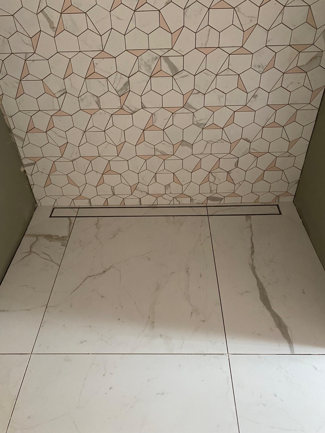 Calacatta gold hexagon mosaic, Bromley. In a mosaic like this, there is more grout line visible than tile surface. The grout colour is doing as much work as the tile. A wrong choice here would overwhelm the pattern. Mosaic tiling service
Matching grout: when the tile should do the talking
Matching the grout colour to the tile colour makes the grout lines disappear. The eye reads the surface as a single plane rather than a grid of individual tiles. This is the right choice when:
The tile pattern or material is the focus. Marble-effect porcelain, natural stone, zellige, or any tile with significant surface variation looks better when the grout doesn’t interrupt it. The beauty is in the stone, not the grid.
You want a room to feel calm and spacious. Fewer visual breaks mean the surfaces read as larger. This is particularly effective in small bathrooms, where matching grout helps the walls and floor feel continuous.
The layout has unavoidable inconsistencies. On surfaces that aren’t perfectly flat, grout line widths can vary slightly. Matching grout hides this. Contrasting grout highlights it. If the substrate has some unevenness that I’ve corrected as much as possible but can’t eliminate entirely, matching grout is more forgiving.
The practical issue with matching grout is colour accuracy. Grout dries lighter than it looks wet. A sample board is essential. I always grout a test area with the intended grout and let it cure fully before confirming the colour with the client. What looks like a good match in the tub can look like a visible mismatch on the wall.
Contrasting grout: when you want definition
Contrasting grout makes each tile individually visible. White tile with dark grout creates a strong grid pattern. It’s a deliberate design choice that reads as graphic and intentional.
This works well for:
Metro and subway tiles. The brick pattern reads more strongly with contrasting grout. White metros with grey or charcoal grout is a classic combination that has worked for a hundred years.
Geometric patterns. Hexagons, chevrons, and other shapes are defined by their edges. Contrasting grout emphasises the geometry.
Feature walls. A single wall or a shower niche in contrasting grout can act as a focal point, with the rest of the room in matching grout.
The risk with contrasting grout: it is unforgiving. Every slight variation in grout line width is visible. Every tile edge that is fractionally higher than its neighbour casts a shadow. Contrasting grout on a less-than-perfect substrate looks amateur. On a well-prepared, flat surface with consistent spacing, it looks sharp.
I’m honest with clients about this. If the wall is plasterboard and the tiles are machine-made with consistent dimensions, contrasting grout can look excellent. If the tiles are handmade (like zellige) with intentional irregularity, contrasting grout fights the aesthetic. The variation that makes zellige beautiful becomes a visible mess when every gap is different and highlighted in a different colour.
The colours that cause problems
White grout in showers. Standard cement-based white grout in a shower will discolour. It absorbs moisture, soap, shampoo residue, and body oils. Within a year, white grout in a shower starts to yellow or develop grey patches. Within two years, it looks tired.
The solutions: use epoxy grout, which is non-porous and resists staining; use a high-quality grout with built-in stain resistance; or choose a light grey instead of white, which hides discolouration while still reading as clean.
Very dark grout on floors. Dark grout on light floor tiles is dramatic in a showroom. In a real bathroom, toothpaste, talcum powder, and cleaning residue settle in the grout lines and show up as white streaks on dark grout. It needs wiping constantly.
Very light grout on kitchen floors. Kitchen floors face cooking grease, food spills, and foot traffic. Light grout between kitchen floor tiles stains. A mid-tone grout — grey, greige, or taupe — is practical. It hides day-to-day marks without looking industrial.
Grout width matters as much as colour
The width of the grout line affects how prominent the grout reads.
Narrow grout lines (1.5-2mm): The minimum for rectified (machine-cut) tiles. The grout is present but minimal. This gives the cleanest, most contemporary look. The tile dominates. Works best with matching grout.
Standard grout lines (2-3mm): Appropriate for most domestic tiling. Allows enough grout for structural integrity and enough room for slight tile size variation. Works with both matching and contrasting grout.
Wide grout lines (4-6mm+): Necessary for handmade tiles like zellige, encaustic, and terracotta, where size variation between tiles requires more tolerance. Also used as a deliberate design feature with certain tile styles. Wide grout lines make the grout a co-equal design element, so the colour choice becomes critical.
Epoxy vs cement grout
Most domestic tiling uses cement-based grout. It’s cheaper, easier to work with, and available in a wide colour range. It’s adequate for most situations.
Epoxy grout is a two-part resin system that cures to a non-porous, stain-resistant, mould-resistant surface. It costs two to three times more than cement grout and has a shorter working time — it hardens faster, which means it needs to be applied and cleaned off more quickly. It requires experience to finish cleanly.
I recommend epoxy grout for:
- Shower floors and walls
- Wet room floors
- Kitchen splashbacks behind the hob
- Any tile where the grout colour is critical and staining would be unacceptable (white grout on a premium tile, for instance)
For dry bathroom walls, hallway floors, and areas with lower moisture exposure, cement-based grout with a sealer is perfectly adequate.
My standard recommendations
After 44 years of grouting tiles across every room type, these are the combinations I default to unless there’s a specific design reason to deviate:
- White tiles, bathroom: Light grey grout. Reads as clean, hides discolouration, doesn’t compete with the tile.
- Grey tiles, bathroom: Matching grey grout. Seamless, calm, contemporary.
- Dark tiles, bathroom: Matching dark grout. Hides water marks and cleaning residue.
- Kitchen floor: Mid-tone grout one shade darker than the tile. Hides cooking residue and foot traffic marks.
- Kitchen splashback behind the hob: Epoxy grout, colour matched to the tile. Grease-resistant, stain-proof.
- Mosaic tiles: Matching grout. With the density of grout lines in a mosaic, contrasting grout overwhelms the tile.
If you’re unsure, bring the grout question to the site visit. I can show you sample boards with different grout colours against your chosen tile. It takes five minutes and prevents a decision you’d live with for a decade. Book a free quote.
Related reading: bathroom tiles complete guide | kitchen backsplash tile ideas | how to spot good tiling
Got a specific question? Call me on 07990 521717 , see the bathroom tiling service, or use the contact form — I'm happy to give advice with no obligation.